From the Assembly Visualization tab, you can rank components based on the values of their custom properties, and activate a spectrum of colors that reflects the relative values of the properties for each component.
To open this tab:
Click Assembly Visualization  (Tools toolbar or Evaluate tab on the CommandManager) or .
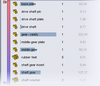
The Assembly Visualization tab  in the FeatureManager design tree panel contains a list of all components in the assembly, sorted initially by file name. There are three columns:
- File name
- Quantity
- Property (initially Mass)
Click a column header to sort by its parameter.
Buttons
 / /  |
Flat/Nested View |
Switches between:
- Nested view, where subassemblies are indented
- Flat view, where subassembly structures are ignored (similar to a parts-only BOM)
|
 / /  |
Show/Hide Value Bars |
Available for numeric properties. Turns the value bars off and on. When the value bars are on, the component with the highest value displays the longest bar. You can set the length of the bars to be calculated relative to the highest-value component or relative to the entire assembly. |
 / / |
Grouped/Ungrouped View |
Switches between:
|
Grouped View
|
Groups multiple instances of a component into a single line item in the list. Grouped View is useful when listing values for properties that are identical for every instance of the component.
|
|
Ungrouped View
|
Lists each instance of a component individually. Ungrouped View is useful when listing values for instance-specific properties, such as Fully mated, which might be different for different instances of the component.
|
If an instance-specific property has different values for different instances and is displayed in Grouped View, its value is listed as ***.
|
Sorting Widget
The sorting widget indicates the columns by which the list is sorted.
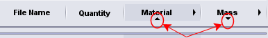
The direction of the widget indicates the sort order:
|
 Ascending Ascending
|
|
|
 Descending Descending
|
|
Click the column header to reverse the sort order.
If only one column has a sorting widget, you can click any other column header to sort the components by that property.
If multiple columns have sorting widgets, you can add and remove parameters from the sorting hierarchy by right-clicking a column header and clicking Add to Sort Hierarchy or Remove from Sort Hierarchy. For more details, see Sorting a Multiple-Property List.
Toggle Color On/Off
Toggles the color spectrum on and off when you click the vertical spectrum bar.
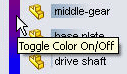
When the spectrum is on, the colors of components in the graphics area correspond to colors in the spectrum, to indicate the relative property value of each component.
Add Slider
Adds a color slider to the spectrum when you click in the blank area to the left of the vertical bar.

You can move the color sliders up and down to modify the color distribution in the spectrum. You can right-click a color slider and change its color or delete it. To return to the original two sliders, right-click any slider and click Reset all.
Rollback Bar
Hides or shows items in the list and graphics area when you drag the bar up or down.

You can drag a bar down from the top of the list:
You can drag a bar up from the bottom of the list:

To return a bar to its original position, right-click it and click Roll to Top or Roll to End.
Filter
Filters the list by text and by component show/hide state.

Type text in the filter field to show only those components whose name contains that text. All other components disappear from the list and from the graphics area. Click  in the filter field to clear the filter.
To make components that are in the hidden state ( ,
,  , etc.) disappear from the list, click the down arrow and select Filter Hidden Components.