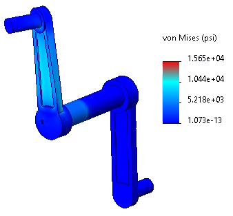
You customize the color map for the stress plot.
-
Right-click Stress1 (-vonMises-) in the Results
 folder and select Chart Options, or double-click the plot legend.
You can also double-click the symbols for loads and restraints to access the PropertyManager for those loads and restraints.
- In the PropertyManager, under Position/Format, click
 to vertically center the plot legend in the right portion of the plot window.
Alternatively, you can drag the plot legend to the desired location.
- Under Color Options:
- Select User defined from the drop-down menu.
- Set No of Chart Colors
 to 3.
to 3.
- Set Base Color to 3. Then click the rightmost color box (before the white boxes), select red from the color palette, and click OK.
The rightmost color is used for the highest stress value.
- Click
 .
.The stress plot generates with the new color map.